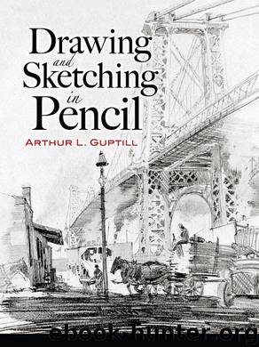
Drawing and Sketching in Pencil by Arthur L. Guptill

Author:Arthur L. Guptill
Language: eng
Format: epub
ISBN: 9780486136486
Publisher: Dover Publications
Published: 2012-10-22T16:00:00+00:00
Figure 26. Illustrating Some of the Principles of Composition in Examples of Various Character.
These principles of unity and balance which we have described all too briefly are most important as they apply to all forms of drawing and design, but we must leave them to offer a few suggestions which relate especially to architectural work.
First of all, in making drawings of architecture strive for an effect of restfulness and repose. A painter of birds and animals or of marine views often desires an appearance of motion, but care must be taken not to suggest much movement when drawing architecture, for each building should look permanent and solid and should appear to rest firmly on the ground. Avoid, therefore, any effect of violent wind or of speeding automobiles or hurrying people. If persons are indicated it is well to have them walking quietly into the picture or approaching the center of interest, for if they are shown walking away from the center towards the margin line the eye follows them and the balance is thus disturbed. There are, of course, exceptions to this. If many people are shown, as in a street scene, they may be represented as going in all directions, for the sense of motion in one direction will be offset by that in the other. Figures of any sort greatly injure a drawing, however, unless they are well drawn and naturally arranged into effective groups, and so should either be omitted entirely or represented well.
Figure 26 is designed to show certain displeasing effects often found in architectural drawings, which it is best to try to avoid. A reference to Diagram 1 will disclose that the foremost corner of the house is equi-distant from the two end margin lines. It is seldom advisable to place a building in this position, a possible exception being a tower which is absolutely symmetrical. Diagram 3 illustrates the same point, while Diagram 5 applies the idea to an interior, and in both of these the effect is somewhat unpleasant. Do not, then, divide the picture space into two equal parts by having some important line directly in the center. Look again at Diagrams 1, 3 and 5 and you will find that the horizon line or eye level towards which all the receding horizontal lines seem to vanish is just one-half way from top to bottom of the picture space, and this division is unsatisfactory, too, and better results are obtained when the horizon or eye level is either above or below the center of the sheet. In the same way the sketch of the bridge at 3, Figure 25, would be better if the top line of the bridge was not so near the center, for here the picture space is also divided into two nearly equal parts by this line. Again, it is usually well to avoid many opposing lines of the same slant or angle, for variety is always desirable. In Diagram 1 the lines at A, B, C and D are all of equal pitch.
Download
This site does not store any files on its server. We only index and link to content provided by other sites. Please contact the content providers to delete copyright contents if any and email us, we'll remove relevant links or contents immediately.
| Cartooning | Colored Pencil |
| Coloring Books for Grown-Ups | Figure Drawing |
| Pastel | Pen & Ink |
| Pencil | Specific Objects |
Adulting by Kelly Williams Brown(3662)
Figure Drawing for Artists by Steve Huston(2787)
Draw Your Day by Samantha Dion Baker(2701)
Drawing Cutting Edge Anatomy by Christopher Hart(2669)
Drawing Shortcuts: Developing Quick Drawing Skills Using Today's Technology by Leggitt Jim(2525)
Make Comics Like the Pros by Greg Pak(2415)
Draw to Win: A Crash Course on How to Lead, Sell, and Innovate With Your Visual Mind by Dan Roam(2275)
How Proust Can Change Your Life by Alain De Botton(2255)
Day by Elie Wiesel(2237)
0041152001443424520 .pdf by Unknown(2212)
How The Mind Works by Steven Pinker(2206)
Rapid Viz: A New Method for the Rapid Visualization of Ideas by Kurt Hanks & Larry Belliston(2189)
Modern Cartooning by Christopher Hart(2182)
Poses for Artists Volume 2 - Standing Poses: An essential reference for figure drawing and the human form. (Inspiring Art and Artists) by Justin Martin(2140)
Draw-A-Saurus by James Silvani(2102)
Learn Drawing Quickly by Sharon Finmark(2088)
Tattoo Art by Doralba Picerno(2079)
Poses for Artists - Dynamic & Sitting: An essential reference for figure drawing and the human form (Inspiring Art and Artists Book 1) by Justin R Martin(2059)
Drawing and Painting Birds by Tim Wootton(1996)
