1592005179.pdf by Unknown
Author:Unknown
Language: eng
Format: epub
ISBN: 1592005179
Published: 2005-05-10T15:58:39+00:00
One Device to Rule Them All
153
R5G6B5, that means that the pixel stores five bits of red information (32 values), six bits of green information (64 values), and five bits of blue information (32 values). The actual color of the pixel is determined by the color created when those three components are combined. For example, if you had a 16-bit pixel that has (31, 63, 31), you’ll get a white pixel, as all the colors are at their full intensity, and when you combine all of those colors, you get white. Likewise, if you had (0, 0, 0), you’d have black, and if you had (31, 31, 0), you’d have orange (full red, half green, no blue).
There are also 16-bit formats, such as X1R5G5B5, that use five bits for each color and the last bit isn’t used.
32-bit formats tend to be a bit more formalized. There are chiefly two variants: X8R8G8B8
and A8R8G8B8. In the first format, the X means that eight bits are ignored and not used at all. In the second format, the A stands for alpha, which is an extra eight bits of data that can be stored per pixel and usually represents transparency effects. A pixel with 0 alpha is completely clear, 255 alpha is fully colored, and 127 alpha means that it is blended with 50
percent translucency with the pixel below it. I’ll get more into alpha later on.
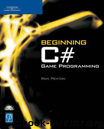
You’re probably going to want to use a 32-bit color format. A few years ago, there was a huge performance difference between 16- and 32-bit colors, but it’s not really a problem anymore. The only time you should really be concerned about using 16-bit colors is when you know you’re using an older graphics card and every bit of speed counts. The major downside of using 16-bit color is that you sometimes get bad banding effects; you can see this effect in Figure 7.3.
Figure 7.3 The left shows a 32-bit rendering of a color gradient, and the right shows a banded 15-bit rendering of a color gradient.
n o t e
I intentionally exaggerated the banding in Figure 7.3 because it’s hard to get the idea without seeing it on a computer screen. But generally, that’s what banding looks like—you can see “lines” in between the colors of a gradient because there’s not enough colors to represent a smooth transition.
Download
This site does not store any files on its server. We only index and link to content provided by other sites. Please contact the content providers to delete copyright contents if any and email us, we'll remove relevant links or contents immediately.
Adulting by Kelly Williams Brown(4683)
Drawing Cutting Edge Anatomy by Christopher Hart(3643)
Figure Drawing for Artists by Steve Huston(3542)
Draw Your Day by Samantha Dion Baker(3474)
Drawing Shortcuts: Developing Quick Drawing Skills Using Today's Technology by Leggitt Jim(3165)
Rapid Viz: A New Method for the Rapid Visualization of Ideas by Kurt Hanks & Larry Belliston(3008)
Make Comics Like the Pros by Greg Pak(2994)
0041152001443424520 .pdf by Unknown(2929)
How The Mind Works by Steven Pinker(2922)
How Proust Can Change Your Life by Alain De Botton(2893)
Day by Elie Wiesel(2869)
Draw to Win: A Crash Course on How to Lead, Sell, and Innovate With Your Visual Mind by Dan Roam(2854)
Draw-A-Saurus by James Silvani(2815)
Tattoo Art by Doralba Picerno(2742)
Modern Cartooning by Christopher Hart(2679)
Learn Drawing Quickly by Sharon Finmark(2644)
Poses for Artists Volume 2 - Standing Poses: An essential reference for figure drawing and the human form. (Inspiring Art and Artists) by Justin Martin(2612)
Drawing and Painting Birds by Tim Wootton(2579)
Poses for Artists - Dynamic & Sitting: An essential reference for figure drawing and the human form (Inspiring Art and Artists Book 1) by Justin R Martin(2545)
