Photographically Speaking: A Deeper Look at Creating Stronger Images (Eva Spring's Library) by David duChemin
Author:David duChemin
Language: eng
Format: epub
Publisher: New Riders
Published: 2012-11-10T16:00:00+00:00
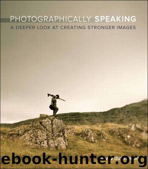
Nikon D3s, 14mm, 1/40 @ f/7.1, ISO 400
Pensacola, Florida, USA, 2011.
In the first image, the static balance is most easily identified by placing an imaginary fulcrum through the middle of the image. In the second image, which is dynamically balanced, the fulcrum needs to come much further to the right, just past a third, giving us further hints about the way the rule of thirds serves our sense of balance if we let it—and if we do so with flexibility.
This is a great example of how our decisions interact with the elements in a scene. It’s also a good example of how the flattening effect of the photograph will change the reality of the image. In real life, those three stones are the same size. In the second photograph, they become three differently sized rocks that all interact with both the frame and the reader, according to how they behave as graphic elements, not rocks. The reader’s mind is likely to know that the three rocks are all the same size, that the foreshortening effect of perspective is just an illusion. But the eye will read it as it is in the image, and move to that apparently larger stone first. Because the eye goes there first, that stone has greater mass and will affect the way you choose to balance, or imbalance, your photograph.
Balance isn’t easy to teach; I suspect it’s something you come about internally as you begin to understand, and get a sense for, visual mass. One of the ways I look at balance in an image is to look at the elements and ask myself, of a possible 100 percent within the image, how much pull does each element exert? It’s approximate, but if I can give myself some loose values for each significant element, I can also get a sense of whether they balance out in the frame. The point isn’t the math; the point is looking critically and mindfully, and recognizing that if one element has significant pull then it needs to be balanced by something else, even negative space. Another trick—and a good exercise once in a while—is to flip the image horizontally in Aperture, Lightroom, or Photoshop. Looking at it flipped can force us to see the relationship of elements to the frame in a new way. Although it will read differently because we shot it assuming the reader would see it as we do, from left to right, the balance will either be there or it won’t.
Negative space is space within an image that is not our immediate subject matter. Its use allows images to breathe and to balance. Having space that is not the subject matter creates a contrast and directs the eye to the thing you want it to see. Negative space has very low visual mass, but it has enough that an element of interest placed, for example, near one of the thirds of the frame will balance out against the two-thirds of the frame now occupied by the negative space.
Download
This site does not store any files on its server. We only index and link to content provided by other sites. Please contact the content providers to delete copyright contents if any and email us, we'll remove relevant links or contents immediately.
Shoot Sexy by Ryan Armbrust(17817)
Portrait Mastery in Black & White: Learn the Signature Style of a Legendary Photographer by Tim Kelly(17072)
Adobe Camera Raw For Digital Photographers Only by Rob Sheppard(17050)
Photographically Speaking: A Deeper Look at Creating Stronger Images (Eva Spring's Library) by David duChemin(16759)
Bombshells: Glamour Girls of a Lifetime by Sullivan Steve(14167)
Art Nude Photography Explained: How to Photograph and Understand Great Art Nude Images by Simon Walden(13112)
Perfect Rhythm by Jae(5505)
Pillow Thoughts by Courtney Peppernell(4365)
The Book of Joy by Dalai Lama(4073)
Good by S. Walden(3638)
The Pixar Touch by David A. Price(3504)
A Dictionary of Sociology by Unknown(3130)
Fantastic Beasts: The Crimes of Grindelwald by J. K. Rowling(3100)
Stacked Decks by The Rotenberg Collection(2950)
Humans of New York by Brandon Stanton(2943)
Read This If You Want to Take Great Photographs by Carroll Henry(2758)
On Photography by Susan Sontag(2690)
Insomniac City by Bill Hayes(2617)
Photographic Guide to the Birds of Indonesia by Strange Morten;(2585)
