The Graphic Design Book: A Comprehensive Guide for Beginners by Atiba Festus
Author:Atiba, Festus [Atiba, Festus]
Language: eng
Format: epub
Publisher: UNKNOWN
Published: 2021-02-16T16:00:00+00:00
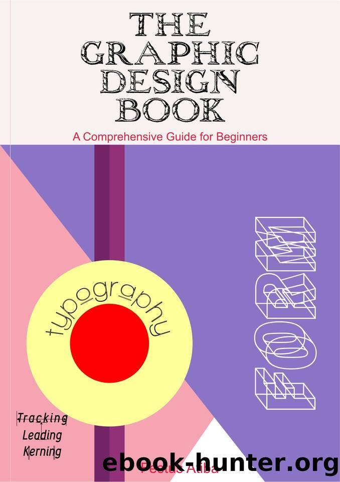
How do you choose the right typeface or font for your design?
With so many different fonts and typefaces to choose from, itâs easy to feel overwhelmed. The process of choosing typefaces or fonts depends on a few other things apart from creativity on the path of the designer. Thus, making the right choice depends on so much more than just seeing what looks nice. Here are a few key considerations based on the following principles:
1. Legibility and Readability
Legibility ârefers to perceptionâ (being able to see as determined by physical limitations of the eye) and readability ârefers to comprehensionâ (understanding the meaning). Good graphic designers aim to achieve excellence in both.
Readability and Legibility are often used synonymously, typographically they are separate but related concepts. Legibility describes how easily individual characters can be distinguished from one another. Readability refers to how easy it is to read the text as a whole, as opposed to the individual character recognition described by legibility.
The typeface chosen should be legible. That is, it should be read without effort. Sometimes legibility is simply a matter of type size; more often, however, it is a matter of typeface design. Case selection always influences legibility. In general, typefaces that are true to the basic letterforms are more legible than typefaces that have been condensed, expanded, embellished, or abstracted.
Donât skimp on readability and legibility. Both of them are vital to the overall outlook of a design: Thereâs nothing worse than a design that looks good but is entirely illegible or readable. When deciding what typefaces or fonts to include in your design, set the style, aesthetic, and voice aside and reflect on whether the font is legible and readable. Can the text be legible without strain? Are the characters distinct enough?
2. Personality
One of the first things to consider is the type of design you are creating. Most importantly, it is imperative that the typography reflects the personality of the brand or product. A good starting point when faced with this challenge is to define the core traits of your brand, and start to gather typefaces that reflect these traits. From there, you can begin to notice a trend.
3. Tone
Are you creating it for a corporate organization? Does it reflect a certain age group â children, teenagers or adults? It is important to consider how the typeface or font harmonizes with the tone of the message. For example, if you want to convey serious or important information, choose a less stylized or decorative font that is both clearly legible and will limit distraction.
4. Be Creative
If youâre not sure where to start, try out your different typefaces and fonts on your own design and see what it looks like. This may be difficult at first but it would yield some positive results when applied with the other principles above. Also taking some time to see what other people are doing can prove useful. Open your eyes to the typography that you see around you. Can you notice similar patterns? Can you see
Download
This site does not store any files on its server. We only index and link to content provided by other sites. Please contact the content providers to delete copyright contents if any and email us, we'll remove relevant links or contents immediately.
Wonder by R.J. Palacio(8582)
Mastering Adobe Animate 2023 - Third Edition by Joseph Labrecque(3844)
Unlabel: Selling You Without Selling Out by Marc Ecko(3664)
Ogilvy on Advertising by David Ogilvy(3624)
Hidden Persuasion: 33 psychological influence techniques in advertising by Marc Andrews & Matthijs van Leeuwen & Rick van Baaren(3566)
Drawing Cutting Edge Anatomy by Christopher Hart(3529)
The Pixar Touch by David A. Price(3439)
POP by Steven Heller(3362)
The Code Book by Simon Singh(3189)
The Art of War Visualized by Jessica Hagy(3009)
Slugfest by Reed Tucker(3005)
The Curated Closet by Anuschka Rees(2975)
Rapid Viz: A New Method for the Rapid Visualization of Ideas by Kurt Hanks & Larry Belliston(2907)
Stacked Decks by The Rotenberg Collection(2883)
365 Days of Wonder by R.J. Palacio(2841)
The Wardrobe Wakeup by Lois Joy Johnson(2786)
Keep Going by Austin Kleon(2763)
Tattoo Art by Doralba Picerno(2670)
Tell Me More by Kelly Corrigan(2654)
