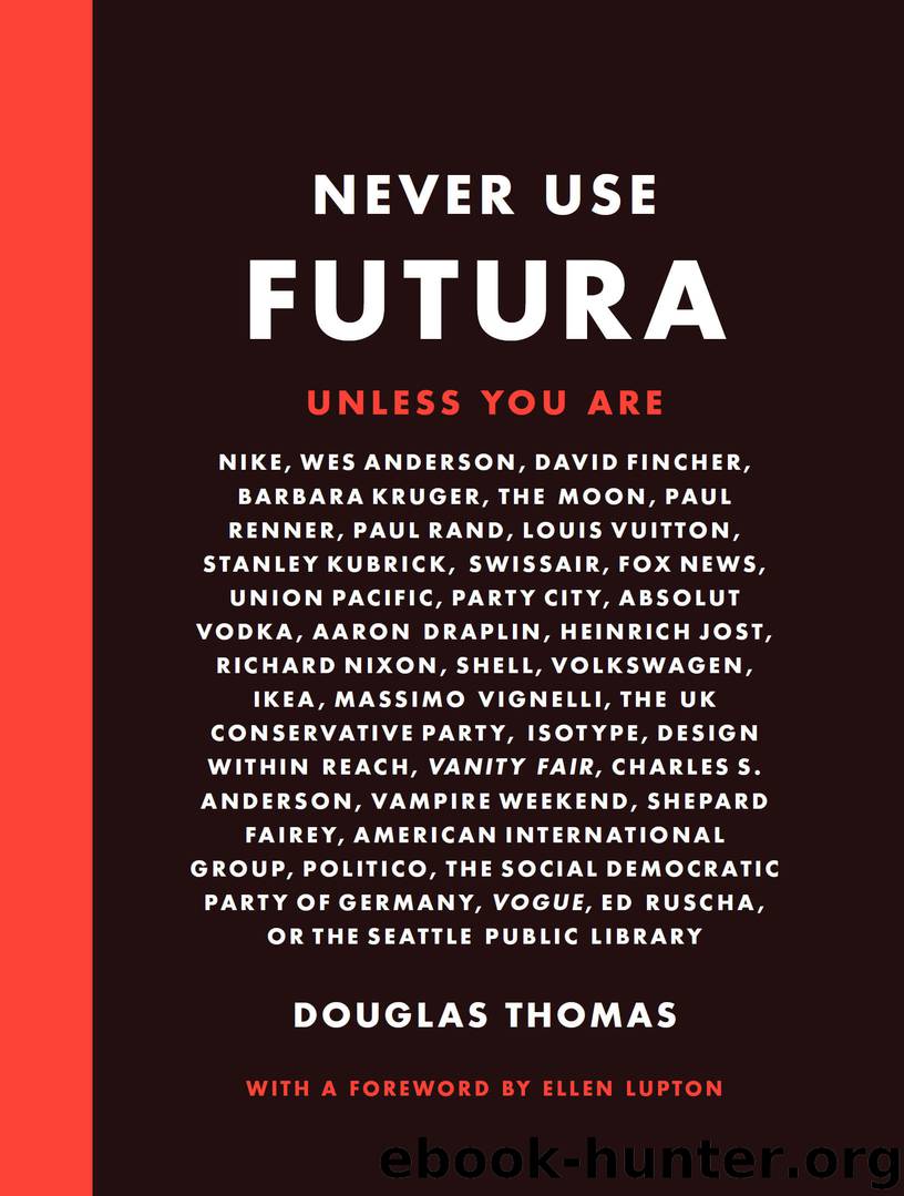
Never Use Futura by Douglas Thomas

Author:Douglas Thomas [Douglas Thomas]
Language: eng
Format: epub, mobi
Publisher: Princeton Architectural Press
Published: 2017-03-15T04:00:00+00:00
This ad was designed by Jerry Ketel and published in the Type Directors Club’s 1992 Typography 13 annual.
Nike chose Futura with good reason: Futura Bold Extra Condensed works well for advertising headlines. It’s visually punchy and packs in a lot of words per line. Of course, effective ads always inspire copies. Take a quick look at magazines from the 1980s and you’ll see that early Nike ads were typographically similar to those of dozens of other companies that shouted their wares in Futura or other bold condensed headlines. By 1992 insipid use of Futura inspired a campaign against its use: Art Directors Against Futura Bold Extra Condensed. The campaign proclaimed in the Type Directors Club annual: “It’s time for Art Directors the world over to boycott the use of Futura Bold Extra Condensed—the most over-used typeface in advertising history. Destroy the Great Satan of clichés and the Little Satan of naked convenience, and rally to the cause of better type selection.”2
Download
This site does not store any files on its server. We only index and link to content provided by other sites. Please contact the content providers to delete copyright contents if any and email us, we'll remove relevant links or contents immediately.
Wonder by R.J. Palacio(8580)
Mastering Adobe Animate 2023 - Third Edition by Joseph Labrecque(3843)
Unlabel: Selling You Without Selling Out by Marc Ecko(3663)
Ogilvy on Advertising by David Ogilvy(3622)
Hidden Persuasion: 33 psychological influence techniques in advertising by Marc Andrews & Matthijs van Leeuwen & Rick van Baaren(3565)
Drawing Cutting Edge Anatomy by Christopher Hart(3529)
The Pixar Touch by David A. Price(3439)
POP by Steven Heller(3361)
The Code Book by Simon Singh(3189)
The Art of War Visualized by Jessica Hagy(3007)
Slugfest by Reed Tucker(3003)
The Curated Closet by Anuschka Rees(2974)
Rapid Viz: A New Method for the Rapid Visualization of Ideas by Kurt Hanks & Larry Belliston(2906)
Stacked Decks by The Rotenberg Collection(2883)
365 Days of Wonder by R.J. Palacio(2838)
The Wardrobe Wakeup by Lois Joy Johnson(2783)
Keep Going by Austin Kleon(2763)
Tattoo Art by Doralba Picerno(2668)
Tell Me More by Kelly Corrigan(2652)
