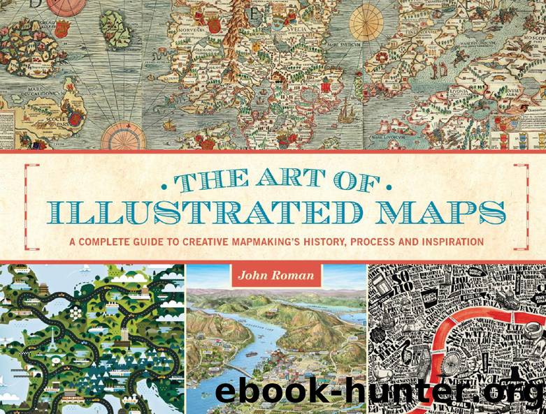
The Art of Illustrated Maps by John Roman

Author:John Roman [Roman, John]
Language: eng
Format: epub
Publisher: HOW Books, an imprint of F+W, A Content + eCommerce Company
HIERARCHY OF DESIGN: THE A-B-C RULE
A similar visual guide that’s incorporated into all manner of printed art is the well-known graphic designer’s device of image or element hierarchy in a composition. We’ll also see how this works in the next section, The Four Design Functions of Illustrated Maps, and we’ve also had a taste of how it is implemented when the golden spiral is part of a basic design. The hierarchy of design can be used in conjunction with the four functions and the spiral, or it can simply be called upon to work on its own in suggesting to the viewer what to look at first, second and third in a designed work of art. These devices are how artists “talk” to their audiences with pictures and symbols.
The hierarchy of design is basically an A-B-C system. The illustrator asks himself, what do I want the viewer to look at first? This will be the A item. What elements are there to support A that will not overshadow or overpower it? These are the B items. And what elements will be included to support the overall image, but not distract from the A or B elements? These are the C items. It sounds like a simple formula, but the ways it can be implemented into designs are virtually unlimited. You can be assured that every advertisement, every book cover, every movie poster, every illustration (including illustrated maps) utilize this system to some degree or another. Sometimes it’s quite easy to spot the A-B-C in an ad. Other times, though the A-B-C rule is in place in a design, even a professional graphic artist has trouble deciphering it. These more complex examples of the A-B-C rule rely on cunning, psychological manipulations beyond the simple placement of items or the sizing of objects in the work.
The easiest place to see the A-B-C rule in action, in its clearest form, is on roadside billboards (those that have been professionally designed as opposed to mom-and-pop, do-it-yourself roadside advertising). A billboard advertisement designer literally has only two or three seconds (max!) to get your attention and to get the client’s message through. Thus billboard ads use the simplest, most blatant A-B-C formula and are the easiest to spot. Take note that the A item need not be the biggest element in a billboard’s design, nor does it need to be dead center. The A item can be (on billboards or on any type of designed product) the smallest component, or the last thing you see. In other words, the Cs and the Bs point your eye toward the A. Or the reverse might be true: a blatant A item leads you to one or two B items—and then toward the all-important C item, which might be the logo or brand name of the product. Already with this description, you can see how tricky the formula can be, and you can get an idea of its effectiveness in communicating to a viewer exactly what you want to communicate.
Download
This site does not store any files on its server. We only index and link to content provided by other sites. Please contact the content providers to delete copyright contents if any and email us, we'll remove relevant links or contents immediately.
| Body Art & Tattoo | Calligraphy |
| Ceramics | Conceptual |
| Digital | Erotic |
| Film & Video | Glass |
| Graffiti & Street Art | Illuminations |
| Installations | Mixed Media |
| Mosaic | Prints |
| Public Art | Video Games |
Kathy Andrews Collection by Kathy Andrews(10541)
Thirteen Reasons Why by Jay Asher(7796)
The Red Files by Lee Winter(2921)
How to Do Nothing by Jenny Odell(2647)
The Genius of Japanese Carpentry by Azby Brown(2612)
Stacked Decks by The Rotenberg Collection(2280)
Tattoo Art by Doralba Picerno(2085)
Champions of Illusion by Susana Martinez-Conde & Stephen Macknik(2078)
The Art of Doom by Bethesda(1774)
The Artist's Way Workbook by Cameron Julia(1734)
Calligraphy For Dummies by Jim Bennett(1644)
Creative Character Design by Bryan Tillman(1562)
Botanical Line Drawing by Peggy Dean(1533)
One Drawing A Day by Veronica Lawlor(1495)
Wall and Piece by Banksy(1461)
The Art of Creative Watercolor by Danielle Donaldson(1453)
Art Of Atari by Tim Lapetino(1326)
Happy Hand Lettering by Jen Wagner(1322)
Artificial Intelligence for Games by Ian Millington & John Funge(1302)
