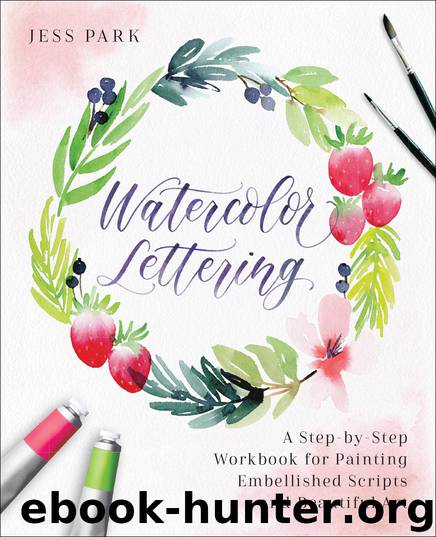
Watercolor Lettering by Jessica Park

Author:Jessica Park
Language: eng
Format: epub
ISBN: 9781612438610
Publisher: Ulysses Press
Published: 2018-08-12T16:00:00+00:00
DOWNSTROKES AND UPSTROKES
The first and most basic thing you need to know about modern calligraphy is that each letter is made up of thick and thin strokes. In contrast to cursive, the writer must pick up their pen after each of these strokes. The pressure of a downward motion creates the thick strokes. Moving the pen upward releases pressure and creates the thin, hairline strokes.
When using a pointed pen (a pointed nib and a pen holder), the pressure of a downstroke will open the tines (ends of the nib), releasing ink onto the paper. The thickness of the line will depend on the width of the space between the tines. Releasing pressure during an upstroke will close the nibs and release less ink, resulting in a thin hairline stroke.
When lettering with a brush or a brush pen, the concept is fairly similar. The pressure of a downstroke will bend the end of the brush, creating a thicker stroke. Releasing pressure during an upstroke results in a thinner line because you are using the thinnest part of the brush, the tip.
It’s best to practice calligraphy lettering with whole arm movements rather than just moving your fingers or your wrist. Whole arm movements are steadier and allow for more freedom—especially when flourishing (page 84).
Download
This site does not store any files on its server. We only index and link to content provided by other sites. Please contact the content providers to delete copyright contents if any and email us, we'll remove relevant links or contents immediately.
| Body Art & Tattoo | Calligraphy |
| Ceramics | Conceptual |
| Digital | Erotic |
| Film & Video | Glass |
| Graffiti & Street Art | Illuminations |
| Installations | Mixed Media |
| Mosaic | Prints |
| Public Art | Video Games |
Kathy Andrews Collection by Kathy Andrews(11832)
Thirteen Reasons Why by Jay Asher(8910)
The Red Files by Lee Winter(3416)
The Genius of Japanese Carpentry by Azby Brown(3309)
How to Do Nothing by Jenny Odell(3302)
Stacked Decks by The Rotenberg Collection(2883)
Tattoo Art by Doralba Picerno(2668)
Champions of Illusion by Susana Martinez-Conde & Stephen Macknik(2452)
The Artist's Way Workbook by Cameron Julia(2271)
The Art of Doom by Bethesda(2159)
Calligraphy For Dummies by Jim Bennett(2026)
Creative Character Design by Bryan Tillman(1927)
Botanical Line Drawing by Peggy Dean(1861)
Wall and Piece by Banksy(1825)
The Art of Creative Watercolor by Danielle Donaldson(1813)
One Drawing A Day by Veronica Lawlor(1804)
Art Of Atari by Tim Lapetino(1792)
Pillars of Eternity Guidebook by Obsidian Entertainment(1670)
Happy Hand Lettering by Jen Wagner(1598)
