R for Data Science Cookbook by David Chiu
Author:David Chiu
Language: eng
Format: epub
Publisher: Packt Publishing
Figure 26. Adjusting the scale of the bar plot
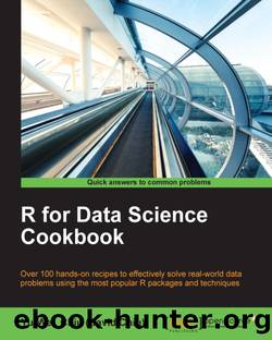
We can change the fill color with the scale_nominal function: > house %>% ggvis(~Status, ~Price, fill=~Status) %>% layer_bars() %>% scale_nominal("fill", range = c("pink", "green", "lightblue"))
Figure 27. Changing the fill color of the bar plot
How it works…
In the previous recipe, we introduced how to change the axis property with the add_axis function. However, the add_axis function only modifies the appearance of the axis; it does not alter the mapping data. To scale both the axis and the mapping data, one can use the scale_* function.
In this example, we begin by making a bar plot with the layer_bar function. We then use scale_numeric to replace the linear scale with a power scale. This rescales both the y axis and the height of the bars. Besides rescaling continuous values with the scale_numeric function, one can change the property of a discrete value with scale_nominal. At the end of the previous recipe, we demonstrated how to use scale_nominal to refill the bar with a given color vector.
Download
This site does not store any files on its server. We only index and link to content provided by other sites. Please contact the content providers to delete copyright contents if any and email us, we'll remove relevant links or contents immediately.
Algorithms of the Intelligent Web by Haralambos Marmanis;Dmitry Babenko(19523)
Azure Data and AI Architect Handbook by Olivier Mertens & Breght Van Baelen(7713)
Building Statistical Models in Python by Huy Hoang Nguyen & Paul N Adams & Stuart J Miller(7707)
Serverless Machine Learning with Amazon Redshift ML by Debu Panda & Phil Bates & Bhanu Pittampally & Sumeet Joshi(7569)
Driving Data Quality with Data Contracts by Andrew Jones(7368)
Data Wrangling on AWS by Navnit Shukla | Sankar M | Sam Palani(7332)
Machine Learning Model Serving Patterns and Best Practices by Md Johirul Islam(7063)
Weapons of Math Destruction by Cathy O'Neil(6371)
Learning SQL by Alan Beaulieu(6349)
Big Data Analysis with Python by Ivan Marin(6005)
Data Engineering with dbt by Roberto Zagni(4979)
Solidity Programming Essentials by Ritesh Modi(4634)
Time Series Analysis with Python Cookbook by Tarek A. Atwan(4450)
Pandas Cookbook by Theodore Petrou(4138)
Blockchain Basics by Daniel Drescher(3643)
Natural Language Processing with Java Cookbook by Richard M. Reese(3206)
Hands-On Machine Learning for Algorithmic Trading by Stefan Jansen(3110)
Learn T-SQL Querying by Pam Lahoud & Pedro Lopes(2981)
Feature Store for Machine Learning by Jayanth Kumar M J(2969)
